Hi everyone!
Back in early October I received the first twelve Brutus Monroe Aqua Pigments. They are liquid watercolors and I couldn't wait to give them a try so I packed them up in an Artbin an took them to my local craft night!

My first use was watercoloring this card, using Brutus Monroe Pumpkin Faces with the sentiment from Super Sentiments.

A week or two ago, I attended the Brutus Monroe 4th Anniversary Party at Christopher's store in Pittsburgh, PA with my friends Iliana, from My Sweet Petunia and Marci, from the Facebook Group, Stamp Junkies. Although I'd been to Christopher's previous store location, this was my first visit to his much larger new location. I loved the huge new space, and as you can see, he went all out decorating in gorgeous holiday fashion for the party.

That night, he released some exclusive party Aqua Pigment colors, and had recently had several other colors released that I didn't own yet, so of course I had to buy them all. Since I was flying home, I decided to have my purchases shipped home rather than risk the glass bottles in my luggage, and they arrived yesterday.
So now I have quite a collection of these fun watercolors. So I needed a larger storage bin.

I was excited to try the new shimmer colors, as well as the metallics, but I also wanted to swatch all of the colors so I would have references now that I have so many.
This is the Metallic Shimmering Gingerbread from the Sparkling Holiday Collection, and I wish I could capture in a photo just how pretty and shimmery that it truly is when it dries.

To make my swatches, I used Fabriano Artistico Cold Press watercolor paper, and wet an area on my paper, working from the bottom to the top, so the lower area had the most water. Then I gently shook each bottle of Aqua Pigments and used the eye dropper to drip 2 drops of the paint onto my ceramic plate. I saturated my paintbrush and painted in side to side strokes, working the color from the top down. I began in the very lightly dampened area and worked my way into the more saturated area giving a nice graduated fade. I put notes on each swatch with a pen, and set them aside to dry fully.

While they were drying, I made labels with my Brother P-Touch label maker.

Once my swatches were dry, I trimmed each of them down to 1 1/4" x 1 3/4". I made sure to note the color name on the back of each swatch as well so I didn't mix them up.

As I was cutting the swatches down, I began trying to put them into an order.
Did I want to keep the shimmers separate from the non-shimmer? Put them in ROYGBIV order? Glue the swatches to cards that would fit into my storage container??

I thought I'd settled on attaching them to cards that would fit inside my storage box, and storing the shimmers and metallics in with the non-shimmers, and keeping the warmer colors and the cooler tones separated like this:

But then I had the following thought: "If I know Christopher, he will probably release more colors the second I glue these down in order and I'll regret the glue permanence!"
So I decided to put the swatches on tags on a 4" metal ring. This way I can add additional colors, or move them around if I find the current order isn't working for me.
I glued my labeled swatches to a 1 1/4 x 3" black cardstock covered cardboard tag, and used a hole punch to add the hole.

And I'm sure glad I decided to put them on tags on a ring, I've already made some changes to the order!
And look how pretty they look!!

Buying, organizing, and using are really three separate hobbies. LOL
So now that the first two are out of the way, it's time to use these new goodies.
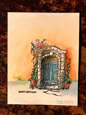
I decided to try out the new watercolors on one of my favorite images and make a birthday card for a good friend. I stamped the Rustic Door image onto a A2 sized panel of cold press watercolor paper using my Original Misti, then painted using several of my current and new colors. I used Orange, Red, Blue, Turquoise, Green, Black and Brown from my previous colors, and the new-to-me Aqua Pigments of Coral, Tinsel, Delphinium and Yellow Green. I love how these pigments move and blend. I added Gilded to the upper design of the door, and Pearl as a highlight to the sunlight portions of the brick archway and sunlit step. I loved the contrast and near glow of the Pearl against the rich earth colors of the stuccoed building. I added the very small and simple birthday sentiment from Cat's Life. I felt a larger sentiment would have detracted too much from the painted image.
That's all from me today. Have a fantastic day!
This makes my heart happy in so many ways! Going to have to copy this!!!
ReplyDeleteLove this! Your watercoloring is amazing!!
ReplyDelete